
Problem statement
Bank of america was planing to migrate its pages into a responsive framework. So they decided to do a design exploration for its future mobile navigation with its most complex product, Home loans. Bank of America'c Home Loan product has 3 sub categories, which in turn has a lot of rates variations and educational resources related to them.
Home loans desktop navigation
Research
The existing home loans desktop site was explored. The important products and their categorization was noted manually. A meeting was set up with the business partners to understand their marketing strategy and how they wouldlike to position their products to their customer.
The overall product architecture looked something like this:

Design Process
Industry Bench marking
Based on the research, I was scouting the internet looking at what industry leaders were using for their mobile web site. I studied the following things in their mobile sites, particularly navigation:
- Information architecture
- Navigation structure
- Design and interaction
- Pros and cons in each design
I also went through alot of articles and research that was conducted earlier on navigation design. Based on these studies I landed on two main navigation strategies: Hamburger and tabbed menu.


Hamburger menu
- Hamburger menu is one of the most widely used menu items in mobile web pages.
- It really addresses the space crunch on a mobile page.
- The discoverability of the menu was the only problem. But when the word menu was added near the hamburger menu icon, people had no problem identifying it.
- We were looking to leverage the Hamburger in 2 ways.
Internal Hamburger menu:
- This approach assumes that the cross product navigation will be handled on a global level and individual products will have separate Hamburger menu.
- The idea behind an internal Hamburger menu is to limit the number of items for the user.
- The user can really focus on the options that are relevant to a product.
- Since the number of menu items were limited in this case, there was no need for any sub categorization.

More viewers were able to find the hamburger menu but just adding the word menu to the icon.
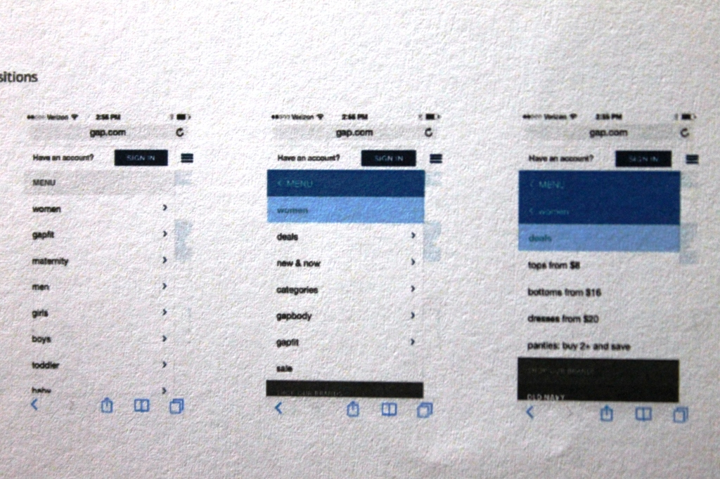
Master Hamburger menu:
- This approach calls for one big menu for the entire site.
- We were trying to leverage the existing Hamburger menu system to integrate product navigation.
- Menu items will be sub categorized and will be exposed to user on a tap.
- This is shown in the image below.
Tabbed Menu
- Tabbed menu is an evolving trend and are being using widely for sales pages.
- Although the number of items that can be shown on a tabbed menu is limited, it does not require user interaction to display menu items.
- It readily solves the discoverablity issue that Hamburger menu presents.
- The other observation was tabbed menu really works will only if the menu items are single words.
- The width of the mobile screen doesn't visually accommodate two word menu items like "Home Loans" or "Home Equity". Sub-categorization of menu items was challenging.


subcategories
In various scenarios there were requirements to sub categorize menus to accommodate different types of features or components, a particular product has to offer. So in those case we were looking at how a second level of menu items can be displayed to the user. After some design exploration we narrowed it down to two options.
The first option would be to use a show hide/accordion menu interaction to expose the sub-menu items. Usually this is invoked when a user taps on a menu item. The sub-menu items would be shown in a different visual style to separate them from level one menu items and also to show a parent-child relationship.
The other option considered the sub-menu items as page elements. So once the user has chosen a level-one or a parent menu item, a mobile page would be displayed to the user which has list of sub-menu items that are part of the page. Adding sub-menu items to the page helped us to simplify the main navigation menu. The selective disclosure would work well for the users who are diving deep in to a product but would be difficult for the users who are trying to explore the product in a broader sense.
Demo/Review
- After comprehensive review and discussion with stake holders and users, the hamburger menu was chooses as the desired navigation system.
- People were readily able to relate to the navigation system because it was well known and users were already using it in their mobile app and web pages.